BRANDING
Competent IT
Corporate Design
Worked Remote | Branding | Corporate Design | Freelance
Refining Competence
Competent IT, a Omsk-based company specialized in software solutions and software development
asked me to re-design their brand and visual identity.
Pioneering brand characteristics were defined through interviews with stakeholders and the target group.
These characteristics form the basis for the visual appearance of the brand and of course my design work…
Competent
Uppercase wordmark indicates a fundamental company.
Confident
Maintain brand protection space and stand alone at the top of the medium.
Fair & cooperative
Decent usage of the logo. No striking usage.
Friendly
Combined letters indicate good business relations.
Modern
No usage of a serif font.
Rational
Good readability with no unnecessary elements.
Qualitative
Avoid multiple logo placement. Simple placement on a clearly visible, free-standing surface.
Logo Design

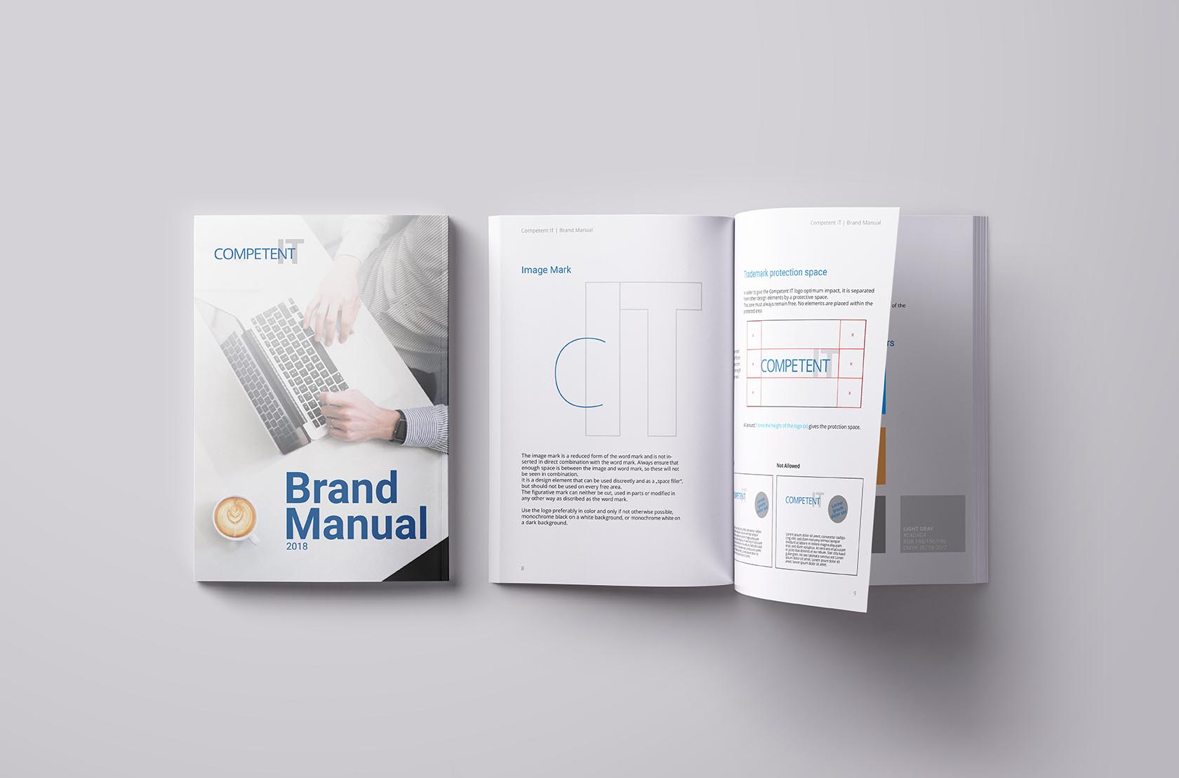
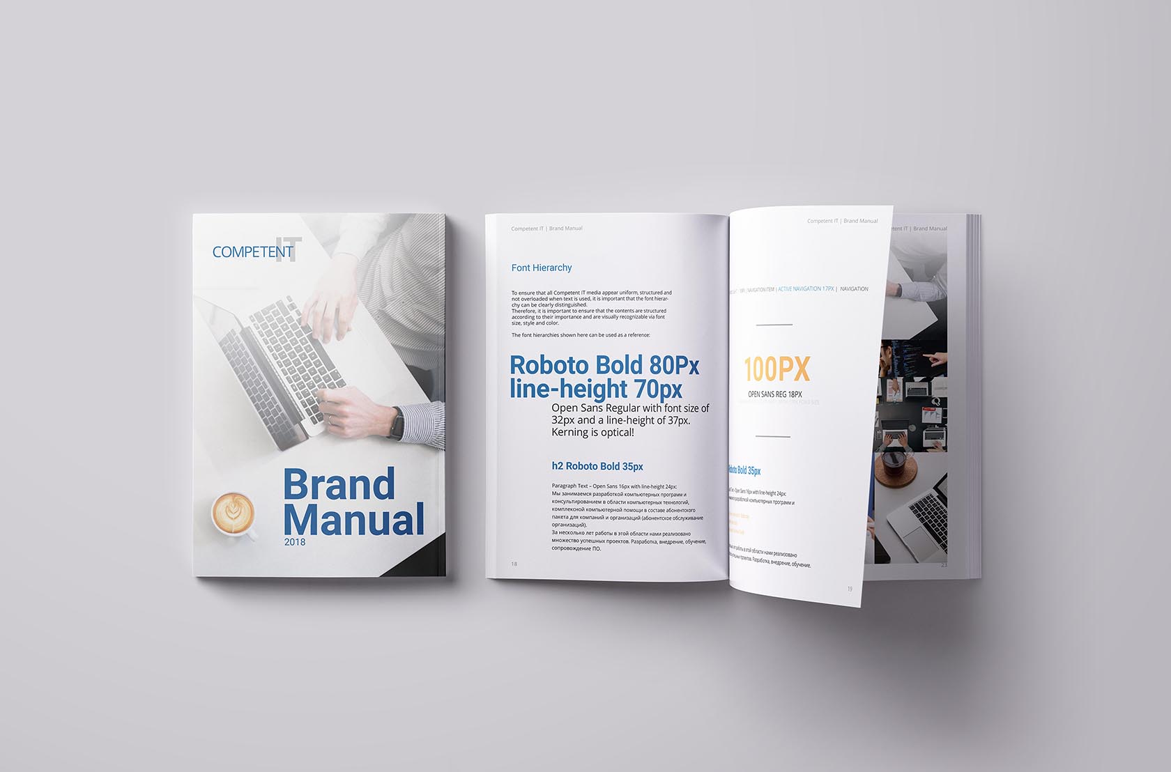
Corporate Fonts
We have defined Roboto and Open Sans as the new corporate typefaces for Competent IT.
The sans-serif grotesque Roboto by Christian Robertson has a „dual nature. It has a mechanical skeleton and the forms are largely geometric. At the same time, the font features friendly and open curves.“
„Open Sans is a humanist sans serif typeface designed by Steve Matteson. Open Sans was designed with an upright stress, open forms and a neutral, yet friendly appearance. It was optimized for print, web, and mobile interfaces, and has excellent legibility characteristics in its letterforms.“
Both fonts can also be used in Cyrillic.
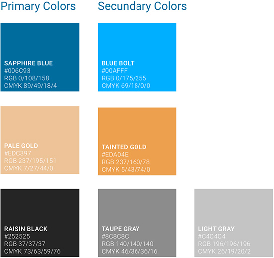
Corporate Colors
The triad of Sapphire Blue, Pale Gold and Raisin Black generates the association of the intended brand image.
This combination is important for the correct representation of the appearance and thusa primary design element of Competent IT corporate communication
