BRANDING
Dana Fülles Coaching
Corporate Design
Worked Remote | Sketch | Branding | Logo Design | Freelance
The brief
Dana Fülles, just started her Ireland-based business as Life-Coach and asked me to help building up her brand and visual identity.
For the beginning all she required was a Logo and Corporate Font and Colors, which she can use for her business stationeries, invoices and company documents.
Brand Research
In order to know the company services and the customers with their desires and requirements we first started with qualitative interviews:
- Who is your target group?
- What is important for them – Desires?
- Requirements? Experience?
- What values are your customers looking for?
- What is important for you as founder – How do want to appear on the market and how not?
- What values does your company represent?
- What values do you want to show most to your customers?
- What are your strengths in the business?
Benchmarking
The next step was to analyze the market where Dana wants so be positioned.
I asked her for other companies and coaches that appear positiv and also negativ to her, to see how they communicate.
I analyzed also the market leaders and what makes them to it.
The last step was to identify the areas where they could be optimized so I can learn for my work.
Requirement specification
Before jumping right into designing, the results of the research were used to create specific requirements which have to be satisfied with the visual appearance.
The goal of these specification is to define how the design has to look, so that the identified values are correctly communicated!
Characteristics of the brand Dana Fülles Coaching
professional
Confident font family with decent colors / low-emotional.
calm
Usage of low saturated colors. No ornaments or decoration.
personal
Light stroke weight and no bold font.
natural
Colors that appear in nature – colors that appear in forests and the sky.
minimalistic
Sans-Serif Font and decent usage of the logo. No striking usage.
realistic
No decorations or objects that distract.
flexibel
Logo can be used in different kind as word-mark image-mark or combination of both.
complete
Usage of a circle as basic geometric object. No open hallmarks in font and letters.
Logo Design
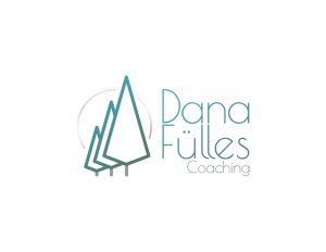
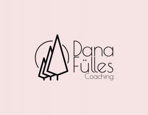
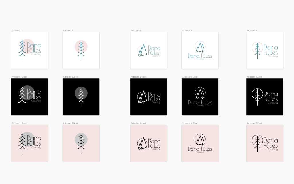
Second Iteration of Drafts
Color Scheme
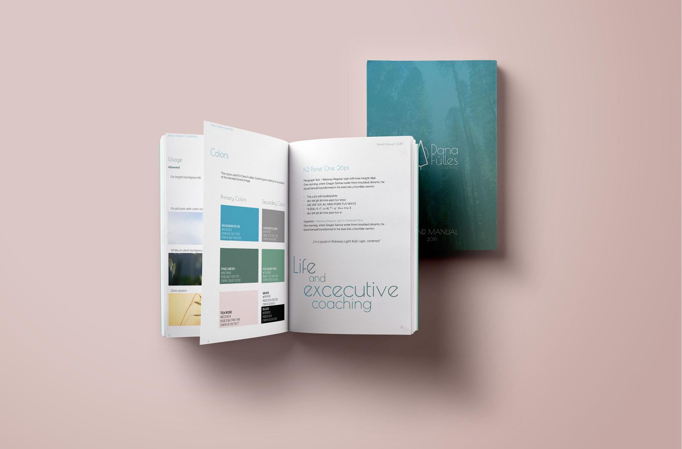
The color palette contain colors selected by me, which harmonize together and communicate the developed brand values.
The dark blue emphasizes realism, while the lighter blue is more aimed at personal character.
The green tones reflect the theme of forest and nature.
The secondary color rosé is personal and lively – a very appropriate color for her brand.
Font
We have defined Poiret One and Raleway as the new corporate typefaces for Dana Fuelles Coaching.
The Poiret One by Denis Masharov is a fresh decorative geometric grotesque with a hint of Art Deco and constructivism.
Poiret One is a unique typeface with light forms and pure elegance. Sleek and simple. Based on geometric forms, it has stylish lines and graceful curves. The font is applicable for large signs, labels, titles, headlines and any type of graphic design on the web, in motion graphics, or in print from t-shirts to posters and logos.
It is also well-suited for short texts and advertising where style is desired. Complete with a lower-case letters, the Poiret One is also useful for allcaps usage.
Raleway is an elegant sans-serif typeface family. Initially designed by Matt McInerney as a single thin weight, it was expanded into a 9 weight family by Pablo Impallari and Rodrigo Fuenzalida in 2012 and iKerned by Igino Marini.
